
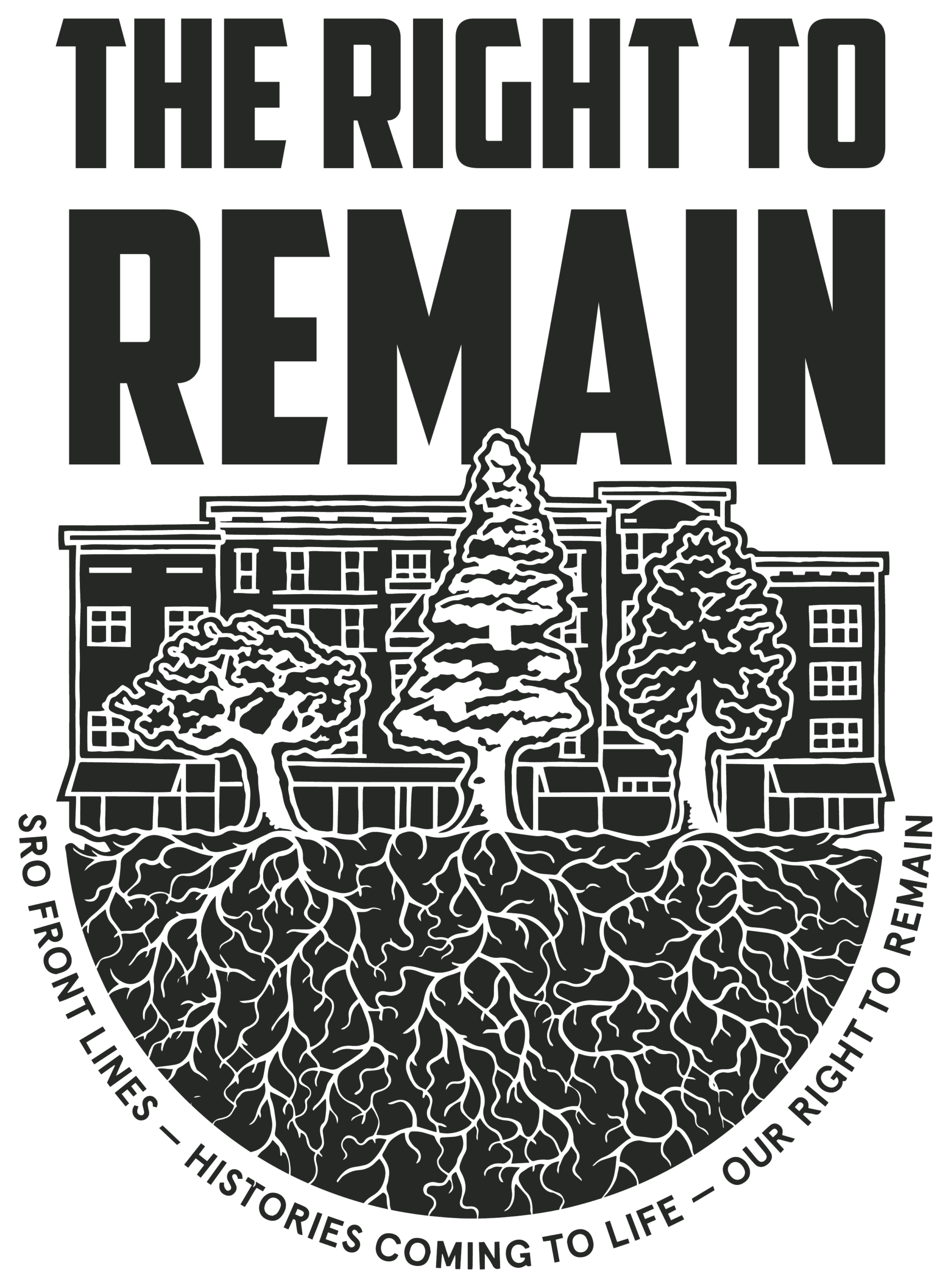
The newly designed logo for The Right To Remain Research Collective has four visual elements. Starting from above is the wordmark for the collective set in the same typeface as its previous logo. It is a strong and bold sans serif that is highly recognizable and will honor the collective’s past logo design.
Below is the architectural element in the logo. With key features such as the rooftop molding, the windows, and the awnings, this buildingscape is meant to represent SRO buildings as a diverse whole, and the home and community these buildings have provided for over a century.
In the foreground are the sakura, the cedar, and the ginkgo, paying homage to the diversity of peoples of the DTES. In addition to the strong cultural significance of these trees, their root systems are their interwoven histories.
Finally, the haiku is an integral part of our identity, that the Collective’s own haiku deserves to rest below the roots, and containing the whole of the logo at the bottom.
It has been a true honor to have a hand in what will be the next logo for The Right To Remain Research Collective. Throughout the process I held closely the notion that “the past is the present, is the future”, and I believe this logo will bring strength to all who are connected to the Collective’s mission.
Marcus Dénomme